Track Seven Brewing Identity.
Overview
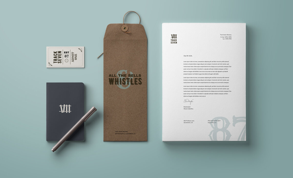
The challenge of this branding project was to develop a beer branding system that referenced the Pacific Railroad that is such an integral part of the city which the small business is based out of. Sacramento is a city with a history that revolves around the railroad system and the owner’s of this business wanted branding that showcased this.
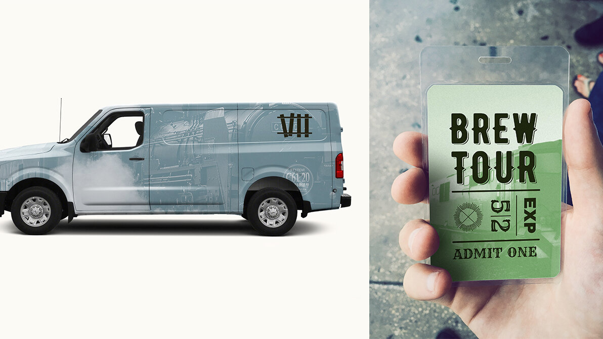
The solution to this challenge is multi faceted. The logo itself is based in part on railroad tracks and the typeface used an older style, display typeface that was influenced by what you might see on the side of a train car, or printed on a cargo container. The color palette used is influenced by the colors see on train cars.

Identity System
For the design of the business cards, I referenced vintage train tickets. I used this as inspiration when creating the layout for the designs. The contrasting horizontal and vertical lines that create the grid are similar to what can be seen on train tickets. Bernier Shade, one of the fonts used, has a nostalgic feel and is similar to historical fonts that would have been used during the time of the Pacific Railroad.
Other embellishments were added to the border to further reference this historical period. All these design elements were carried out through the letterhead system and branding extensions.


